6 Oct 2013

Journal

If you don't like...


... delicious food, shopping and art events without the prevalence of the stereotypical artsy-fartsy crowd, Amsterdam is probably not your place to be.

Well, I do love the hartelijke grachtenstad. That is why I jumped at the opportunity to visit the photography fair Unseen at Westergasfabriek, an unused gas works built in the 19th century.


In its second year the fair housed 50 galleries and exhibited works from yet relatively unknown as well as some established photographers. At the book market enthusiasts, publishers and other professionals came together to present and discuss the state of independent publishing. Because it was a little to crowded you did not really feel invited to delve among the books. Obviously the market functioned more as a place for networking. However, if you didn't mind the density and gatherings between booths, there was supposedly a lot to discover. In addition visitors had the opportunity to attend talks and interviews or sit down and enjoy a varied selection of film screenings. As participation and large-scale presentations are a sure way to win over visitors, the project Inside Out by JR was definitely a little sensation. Visitors could have their poster size portraits taken, get them printed straight away, add them to the exhibition and in this way become part of it.     

           
Despite all the great ideas you always have to leave some room for criticism. 
Although I risk sounding like a philistine, I'll just ask bluntly: What was the big deal about the Miss Titus presentation? During her presentation photographer Melina Gibson was surrounded by spectators who were intrigued by the action in front of them and suddenly broke out in applause. Needless to say, I had to make my way through the crowd in order to get a glance at the spectacle. All I saw was the artist folding paper and wrapping a book. Either I just missed an incredible creative outburst or simply didn't get it.             


But that is O.K.. I'd rather keep in memory the grainy and melancholic black-and-white photographs of Anders Petersen (Stieglitz19, Antwerp), David Verbeek's mysterious and somehow alluring photographs shot in night-time Tapei (Galerie Ron Mandos, Amsterdam), Astrid Kruse Jensen's familiar appearing and equally disturbing images (Martin Asbaek Gallery, Copenhagen), and Bien-U Bae's large-scale photographs that transfer the beholder into a state of contemplation (Aando Fine Arts, Berlin), and a number of other works.


Bien-U Bae, 2006


5 Aug 2013

Journal


The story goes on...


...as I am back from my self-prescribed writing break. Yes, I have not written a single word for almost two weeks. After I got rid of my guilty conscience - that annoying but constant companion of mine -  I enjoyed not thinking about how to put down in words what I am seeing while I am seeing it.
  

So, let me collect my memories of the Philip-Lorca diCorcia exhibition that I visited during a trip to my hometown Frankfurt. 


First of all, I have always been intrigued by that name. Writing or reading it is never the same as hearing it or saying "Philip-Lorca diCorcia" out loud. The poetic sound cannot be denied. In the same way his pictures are captivating and enigmatic.    


DiCorcia tells stories that remain mysteries.
The distinctive mix of documentary and fiction, natural and artificial lighting, emotion and construction, and the singular moment and an untold narrative creates an ambivalent as well as mesmerising effect.
The photographs seem to tell the beholder as much about the outside world as about himself/herself, appearing simultaneously familiar and unfamiliar. 


In this sense it almost feels like returning home. It is beautiful yet bizarre that stories always go on.


Philip-Lorca DiCorcia. Photographs 1975-2012. Schirn Kunsthalle, Frankfurt. 20 June - 8 September 2013. 
          

10 Jul 2013

Books

Don´t know....


....how I could not have noticed this book before. 

The Rizzoli Bookshop at Somerset House can make someone with a passion for photography and fashion (okay, I am talking about myself) very happy. 
Well, if fashion and books are not a good investment, then what is? My closet and bookshelves would definitely agree.

So last time I went strolling through the shop I discovered Dazed & Confused - Making it up as we go along, a collection of the magazine's most remarkable covers and features. 


Some of these photographs are well know and are often seen on the walls of galleries. While making their way into our collective memory their original context often gets lost and the pictures appear as the work of a single author. Embedded within the pages of the magazine the collaborative quality of fashion photography is enhanced.  


Nick Knight's 'Access-Able' pictures of Aimee Mullens in the Alexander McQueen issue belong to my all time favourites. Startling and yet aesthetic these photographs intend to break the rules of what is acceptable in a lifestyle/fashion-magazine whilst conveying messages that go beyond the commercial strategy of shock.     


Considering that the '90s are back in fashion (predictably; though, who was actually prepared for that return?) the book is also a source of style inspiration.    


Dazed & Confused - Making it up as we go along. Hack, Jefferson/Furniss, Jo-Ann (Ed.). New York, 2011.

Photographs:
Rankin. Kate Moss. Styling by Katie Grand. June 1998.
Olins, Josh. The Amsterdam Chainsaw Massacre. Styling by Katie Shilingford. February 2010.
Knight, Nick. Access-Able. Styling by Katie England. September 1998.
Rankin. TV is Boring. Styling by Katie Grand. 1994. 


23 Jun 2013

Journal

Finally...


... I had the chance to visit the Erwin Blumenfeld exhibition at Somerset House.

The exhibition concentrates on Blumenfeld's artistic period in New York and some of his most extraordinary fashion photographs in colour are on display. After the photographer's death in 1969 his  estate was divided into four stakeholders and due to conflicts between the parties many of these images never got published or presented to the public. Sadly he is not as well known as his contemporaries, e.g. Irving Penn or Richard Avedon. However, as history has taught us that does not necessarily reflect the brilliance of an artist. Blumenfeld belongs without doubt to the most influential photographers of the 20th century. Constantly experimenting and pushing the boundaries he found innovative and imaginative ways to present fashion and photograph the most beautiful women of his time. 


Erwin Blumenfeld. Grace Kelly in Cosmopolitan, 1955.
Erwin Blumenfeld. Variant of a cover for Vogue, 1949.


After his death his outstanding reputation gradually faded into obscurity, however, this phase has fortunately come to an end. Following the exhibition at Somerset House is a Retrospective of his work in the Jeu de Paume, Paris in October. Although the Paris exhibition is definitely worth a trip, I would not want to have missed the smaller one in London. 
Since it focuses mainly on his fashion photography additional show cases feature the images in their original context - the pages of Vogue and Harper's Bazaar. Detaching the photographs from the pages of the magazine often implies a shift of meaning. That is why I enjoy the concept of combining new prints on the walls and the original magazines. 

Even though I would love to visit the Retrospective in Paris, I will not have to feel all too miserable should  I not make it. I am already looking forward to two other exhibitions at Somerset House. 


Miles Aldridge. I Only Want You to Love Me #1, 2011. 

Next month Miles Aldridge: I Only Want You to Love Me opens and will be the largest exhibition of his work to this date.  


Mario Testino. Isabella Blow, 1997.

My personal highlight of the year is probably Isabella Blow: Fashion Galore! 
The exhibition will display pieces from her private collection, which is now owned by Daphne Guinness.
Come November I will be almost as excited as waiting to open Christmas presents. 


For more information visit www.somersethouse.org.uk

6 Jun 2013

Journal

Nice....

Jason Evans
(www.jasonevans.info)


...is usually not the first thing I'm thinking after waking up in the morning. I am rather cranky before I've  had my first cup of coffee.

While I drink my coffee I practice another morning ritual: www.thedailynice.com   
simple white web page + photo of something that made Jason Evans happy = smile
Thanks Daily Nice!


2 Jun 2013

All time favourites

Punk's not dead...


Jean Baptiste Mondino. Punk's Not Dead in: The Face, 1990.

.... at the moment it seems that punk is very much alive and can be spotted everywhere. The most publicly criticised event was probably this year's Met Gala to celebrate the opening of the exhibition PUNK: Chaos to Couture. Personally, I found it hilarious to see all the celebrities dressed up in their glamourous "punk" outfits. 
As Madonna was one of the few who seemed to have understood the theme, she did put on every fashion cliché punk has to offer - from a tartan jacket to a dog collar necklace and ripped fishnet tights. Well done, Madonna - I mean, it is the gala of the Costume Institute (!) and we have 2013 and are not stuck in the 1970s, so who cares if wasn't exactly a convincing interpretation of punk. 


Madonna - Met Gala 2013 
(Photo: Getty Images)


I have learned from previous experience that I cannot pull off punk style at all. Every time I tried, I ended up looking like I'm going to a Halloween party. Nevertheless, I am a huge admirer of the era.     

The image above is one of my all time favourites. When it was published in 1990 the original spirit of the subculture was all long gone and punk's fashion had found its way into mainstream culture. It indicates how distorted versions of punk live on through the appropriation of succeeding generations. The professional and polished aesthetic of the image doesn't seem to fit the rebellious DIY concept of punk. However, the subculture has had a lasting influence on fashion and the constant returns of punk motifs reference fashion's ambivalence of evanescence and revitalisation. 
Mondino's image seems to admit that punk in its original form is dead but that the desire to express rebellion and otherness lives on. 

No wonder, Abbey Lee Kershew's political statement written on her torso was regarded as the most authentic expression of punk on this particular evening. Flashing her stomach - not to forget her black knickers and almost (!) bare breasts - at a posh event like this, was probably the most true-to-punk way to communicate her message. (Okay, it could have been even a bit more rebellious.) 
As Vivienne Westwood recalls the good old days: "We were interested in what we thought was rebellious, in wanting to annoy (English) people - and the way to do that was through sex."         


Abbey Lee Kershew - Met Gala 2013
(Photo: justjared.com) 


Reference: Vivienne Westwood cited in: Arnold, Rebecca. Fashion, Desire and Anxiety. London, 2001: p. 47.


21 May 2013

Journal

Like a BLITZ...


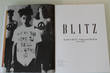
... I am online to write a few words about the new book BLITZ, which got published in April. 

However, first of all I have to apologise for not having written anything in such a long time. I had promised myself that, should I start a blog one day, I would write every week. Pfff, I know, two weeks after my first post it seems I have already forgotten all about my good intentions.

To soothe my guilty conscience, let me tell you about my Saturday afternoon.  
The ICA celebrated the launch of the book with a series of talks and a film screening. I was very excited to see the 80s film Liquid Sky about an alien landing in New York. Unfortunately I only made it to one of the events. 
Well, better than nothing and the panel discussion actually turned out to be quite interesting.
Topics were contemporary Fashion & Style Magazines and the history of BLITZ. Guests were the two founders of the magazine, Carey Labovitch and Simon Tesler, as well as fashion editor/stylist Max Pearmain and the editor of Clash Magazine. 
I really like Pearmain's work for POP and Arena Homme +. His style is very quirky and I guess you either find it awesome or awful. Since I definitely belong to the first group I was thrilled to hear him talk about his work. Okay, I was a bit afraid that he was one of those arrogant fashion people who seem to have such a crappy personality that it's hard to still like their work. Sorry, I got a little off track. I am not getting started on how often I had that experience with personalities from the art and fashion scene. Fortunately that did not happen on Saturday and I can still unconditionally enjoy Pearman's work. 
The discussion was especially interesting concerning the differences in the production procedures of BLITZ and today's magazines. We sometimes tend to forget what an impact the internet and the possibility to create your own blog has had on all creative areas. Compared to reading a blog, magazines can sometimes be rather impersonal. As magazines can become a regular part of our life, it is nice to see the faces behind these magazines.                          


To be honest, I hadn't heard a lot about BLITZ before. 
The magazine was launched in 1980. The same year i-D and The Face emerged. Since i-D is the only one of the three magazines that still exists, I am much more familiar with its style. 
For magazines are often regarded as evenascent, a collection like the book BLITZ changes the perception of a monthly magazine. The intentions and particular visual style becomes apparent. The book focuses on the work of fashion editor Iain Webb who contributed his distinctive style to BLITZ from 1982-1987. Besides the rich visual content the book also compiles original BLITZ interviews and memories of those who are part of the magazine's history; from Vivienne Westwood to David LaChapelle. 
Now I definitely know a lot more about BLITZ and there is one more side-effect I should warn you about: It makes you wanna put on some glamourous (but definitely not office suitable) make-up and raid your parents wardrobe in order to throw on some good old 80s style clothes.            


(Webb, Iain R. BLITZ. As seen in BLITZ - Fashioning'80s Style. London, 2013.)


11 May 2013

Calendar

In case....


Martin Parr. Life's A Beach (Mini Edition). New York, Aperture: 2013.


... you are in New York next weekend. 

Aperture Gallery is currently presenting a Martin Parr exhibition and next Saturday Parr himself will be there to shoot beach-themed portraits. $400 and you can go home with your own signed Martin Parr portrait. Not a keen price. But, hey, you can hang it up in your living room and compare yourself to one of those lucky people who back in the day went to Warhol's Factory and had their portrait made.

I won't be able to make it to New York next weekend. Instead I might just order the book and take it to Brighton to gain some first hand experience of British beach culture. The chances are high that it will rain, so hopefully the book will stay dry and the wind won't blow sand into my eyes. I am hoping for a sunny day but you never know what to expect - Life's a beach.


For more information visit: www.aperture.org        


9 May 2013

All time favourites

Ever fallen in love.....


Sarah Moon. Fashion 3, Chanel. 1997.

... with a picture? Because I have. 
Frankly, I am not very into music. There are some songs I do like a lot but to say that I love them would be an exaggeration. Whereas there are plenty of pictures I remember seeing and my immediate reaction was: "Oh, I love it." 
That's what happened when I saw the image above for the first time and still happens each time I see it. I cannot tell you exactly why. It is obviously beautiful. Still, there is something about it I cannot describe. You might call it punctum. When I close my eyes and recall it - these red nails are etched in my memory.